Distinctive marks developed for clarity, recognition and practical use across physical and digital touchpoints.
Identity foundations
A clear mark starts with a clear idea.
We begin with the organisation, audience and context in which the identity must work. Concepts are reduced to recognisable forms, then reviewed for proportion, legibility and use at different scales.
The result is a mark with an understandable rationale and enough discipline to remain coherent across applications.
Selected work
Logo systems and visual studies.
01
TRI-FIX
An identity exploration for an architectural practice, built around precision, focus and the act of resolving design faults.
02
Department of Environment, Forest and Climate Change
A protective environmental mark developed through simplified leaf and globe geometry.
03
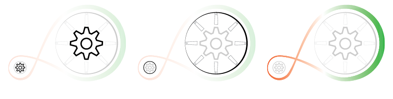
Atmanirbhar Bharat
A self-reliance identity using the motion and craft associations of the charkha.
04
Baatein
An instant-messaging identity shaped around a speech form and the act of conversation.
05
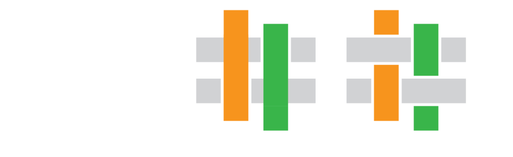
Nastile
A textile retail identity informed by weaving, pattern and Indian colour references.
06
K-RIDE
A mobility identity exploring speed, dependable travel and the rail journey.
Next step
Give the identity a clear starting point.
Share the organisation, audience and applications. We will define the most useful route from idea to a working mark.